|
|
Post by Gengar on Oct 2, 2012 9:53:33 GMT -8
okay then
|
|
Deleted
Deleted Member
Posts: 0
|
Post by Deleted on Oct 23, 2012 11:33:15 GMT -8
OH OH OH!!
Can I make the Christmas theme since I miss October!; u ;
I'd love to make a theme for the forums!!
|
|
|
|
Post by Yoh on Oct 23, 2012 12:29:29 GMT -8
Since we already have a banner for December might as well.
|
|
|
|
Post by Gengar on Oct 23, 2012 12:38:37 GMT -8
wat. We already have a banner for December?
|
|
Deleted
Deleted Member
Posts: 0
|
Post by Deleted on Oct 23, 2012 12:46:25 GMT -8
Chloe made the Secret Santa banner
|
|
|
|
Post by Yoh on Oct 23, 2012 12:48:22 GMT -8
Oh...wait there's a difference?
|
|
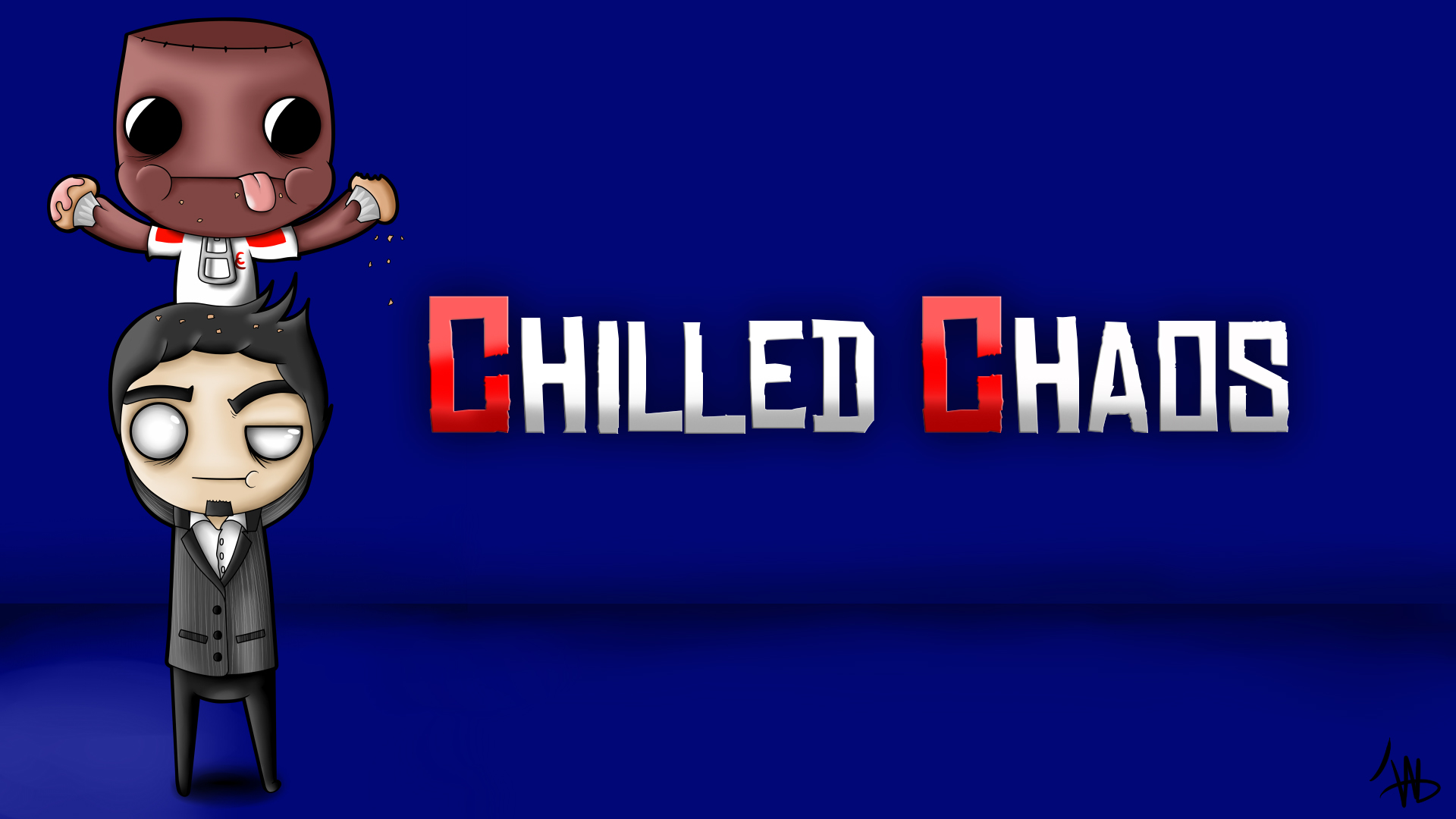
Chilled Chaos
Exceptional Advancer
 Follow me on twitter!
Posts: 1,841
Favorite Pokemon: Jolteon or Charmander
|
Post by Chilled Chaos on Oct 23, 2012 13:01:07 GMT -8
Christmas theme would be nice.
|
|
|
|
Post by Yoh on Oct 23, 2012 13:03:43 GMT -8
I think it would be better for a winter theme.
|
|
|
|
Post by KatherineLuvsMJ on Oct 23, 2012 14:26:42 GMT -8
hmm the theme should be about winter or snow! or about ash and may goin to the beach!  |
|
Deleted
Deleted Member
Posts: 0
|
Post by Deleted on Oct 23, 2012 14:28:38 GMT -8
Oh, I didn't know!!; u ; Well, since Chloe made one for Christmas, then can I make one for either winter or New Years?  |
|
|
|
Post by Yoh on Oct 23, 2012 14:32:09 GMT -8
K!
|
|
|
|
Post by Dr. Phil E. Sophical on Oct 23, 2012 17:17:37 GMT -8
Okay, so I’m taking Intro to Psychology this year, and we recently did our brief discussion on “color psychologyâ€. Basically, we learned what colors are associated with what feelings, and how to use colors to manipulate the human mind. Knowing that, I’ve come up with a blueprint for a theme that is specifically engineered to elicit the optimal response from site visitors (on a subconscious level).
My proposal:
Base color (background): Blue.
Why: Seeing the color blue actually causes the brain to release chemicals that are calming. In general, the color blue is associated with steadfastness, dependability, wisdom, and loyalty, as well as being a very calming easy-on-the-eye cool color.
Application: I would recommend using #3D59AB as the main body. If you don’t want a single shade for the background, consider adding some relief with #006699. These particular shades of blue are found to be particularly calming and restful.
Detail color (text/outlines): White.
Why: White is commonly associated with safety. (Things go bump in the night, not in bright white daylight) It’s also associated with creativity, like a blank slate. Being as white is a neutral color, it complements a cool shade of blue nicely, as well as being easy to read when placed against a cool-color background.
Application: I would suggest using standard, plain, pure, white (#FFFFFFFF). Doing so will maximize the subconscious effects of the color, as well as blending better with the base color, providing for an appearance that is much easier on the eyes.
Accent Color (Graphics/banners): Yellow.
Why: When surrounded by yellow, the brain releases more serotonin, providing for a cheerful and optimistic mood. In addition, yellow is shown to sharpen focus and stimulate creative thinking. (Legal pads are yellow for a reason.) More golden shades tend to offer better results, promising better times, whereas paler shades are sometime associated with cowardice.
Application: For use as an accent color, I would first recommend using #FFE600. Be careful not over use the color, as it may become overbearing when used excessively.
Fine Accent Color (small details): Red.
Why: Red draws attention, as it is often the color that the eye looks to first. It is most often associated with energy and excitement. In addition, red tends to make subjects appear more attractive to the eye. When used well, red can help draw attention to important areas, while providing a sort of energy-boost.
Application: For best effect, use primarily around areas of major focus. In the case of the Advancers forums, I would recommend red be used primarily around the banner, so as to draw attention to that focal point when the site first loads. As far as shade is concerned, I would recommend #FF000A. As is with yellow, be careful not to over-use the color, as excessive amounts will become overbearing.
Predicted General Effect: The idea of this color scheme is to subconsciously promote attractive qualities such as serenity and creativity, using a cool-shade pallet, while maintaining an air of excitement, energy, and optimism through use of a warm-shade pallet. The ratio of cool colors to warm ones (with cool being predominant) is designed to provide a design that is both practical, and easy on the eyes. It is important to realize that the effects of a new color scheme such as this one I have proposed may not seem drastic, but they should be noticeable under typical conditions.
|
|
|
|
Post by Advanceshipping's Mew on Oct 24, 2012 10:47:18 GMT -8
Thought about a fic with our (original) Avatars xD
With the style of SSBB x)
That would be epic, but just for our forum :x
|
|
|
|
Post by PichuAuraGuardian19 on Oct 24, 2012 10:50:22 GMT -8
Nice idea, wrong thread.
|
|
|
|
Post by Advanceshipping's Mew on Oct 24, 2012 11:18:05 GMT -8
Why? =/
It's a new idea
|
|